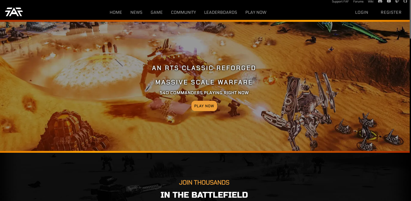
Well, it’s been almost a month since the new website released so this news article is a bit late to say the least. Nonetheless, I’m very excited to see the new website up and running without any issues. Couple of day one bugs were squashed and it seems everything else is functioning smoothly.
The website itself
The new website does not only bring a thick coat of “modern” paint but also a lot of new content and other small improvements. From new pages that were badly needed in our official website such as main changes FAF has implemented like engymod, a tutorial page or a donations page explaining how we manage our donations and other badly needed pages. Other improvements are things the user just doesn’t see, where the real magic happens in the back, like how now we don’t slow down the website bringing huge libraries like jquery and bootstrap or how much fat has been cut from the old code or how the website caches (holds) certain information instead of continuing to request it from the server everytime someone visits specific pages (newshub, leaderboards, clans), lessening its load on FAF infrastructure.
Color scheme and “new” logo
The new website actually has a color scheme. Something that is good to keep FAF represented well or to kinda like have our own brand colors. The colors I choose where black/dark grey and a gold/dark orange to simulate the colors of a forge. I think it looks very elegant and matches the muteness of the game adequately. However, in the future an accessibility mode should be implemented to change the theme to a blue (because FYI, blue is more or less the best color for colorblind people to read across the board).
There was also a very subtle change with the FAF logo, which was removing the god awful circle that goes around it. Now its less about if it looks good or not without the circle, its about usefulness. Here’s my case to remove the circle: Putting a rectangle inside a circle makes the rectangle very small, the words “FAF” are like a rectangle, so when we use the circle logo, we need to either have FAF in a small size or we need to give the circle a lot of size because its 1:1 (like a square). In the other hand, if we remove the circle, we have a clean 16:9 rectangle logo that is easy to fit around and read clearly. Plus it looks 100 times cleaner and smoother while the circle provides an old and clunky appearance.

My work as a volunteer and newb to web development
The FAF website has been my one and only project as a software developer. Originally I just wanted to change the images in the old website because I was the media manager for the promotions team, designing images and logos for tourneys or other exciting news. However, I clearly got too much into the whole aspect of creating websites and I got the bright idea of re-designing the website. This was around November-December 2021. Let me tell you, it was a very difficult challenge. Not only having to learn how to program for the first time, but having to transverse a mess of a website that had band aids over band aids to keep it running. At times I would give up for a month or two and then come back to it. I believe if the previous contributors of the website would have had a long term approach over a short term one to the website, it wouldn’t have been so difficult to navigate certain parts. Nonetheless, the website taught me a lot, I didn’t know programming could be this fun, exciting and challenging. To the point that I’m switching careers just because of how insanely cool doing this is and it all started with something so small as creating images for FAF. The pride I feel showing others “hey, I made this, people are using it” or being the one called to fix an issue or add a new feature to the website, it makes me feel like a real developer.
Long term over short term
Funnily enough, I started with a website re-design but now its a website re-make. I’m currently reworking our backend logic and making sure the website as a whole is as compact and simple as it can be. I want to be able to leave the website and know that if someone wants to add a feature or modify a route, they won’t face lots of bloatware and redundant code. I want to make sure adding new features and pages doesn’t break the website. I don’t recall where it is but I recall reading Brutus saying nobody wanted to touch the website because it was a dumpster fire or something along those lines. I’m happy to say, the new website is a clean and fixed from the ailments of the past. No longer a place where to add a page you had to create 3 new files and write 1 line on another 2 files or where we had 21 javascript files that served absolutely no purpose and I deleted them by putting their function in a for loop around 8 lines long.
Future Plans
Well, I don’t think I’ll have the same crazy amount of time to keep working on the FAF website forever but, I foresee a new home page for our client, leaderboards with long term stats, more clan specific stats and improvements to the clan system and much more. Its all going to depend on how free I am because nowadays I’m working with some classmates on some other projects and I might take long to implement these new features. But either way, know that I will always be here to guide others and fix any issues the website comes up with!
